Future Engineers
An education program for AMSE
| Client: AMSE in collaboration with NASA
| Project: Freelance
| Role: Visual Product Designer
| Process: UI design for site and identity

Challenge
Future Engineers is a series of 3D space challenges, sponsored by the ASME Foundation, with technical assistance from NASA. The winner got their design 3D-printed onboard the International Space Station. The assignment consisted of both UX & UI for the challenge site as well as brand identity.
Result
As a result the program itself got successful and gained a grant from the US Department of Education for 2 years. Below follows parts of the challenge material. Read more at NASA.


“How might we design a easy to use platform for both students and teachers to use? ”
“The winner in the first challenge got their design 3D-printed onboard the International Space Station.”

ASTRONAUT AT THE INTERNATIONAL SPACE STATION
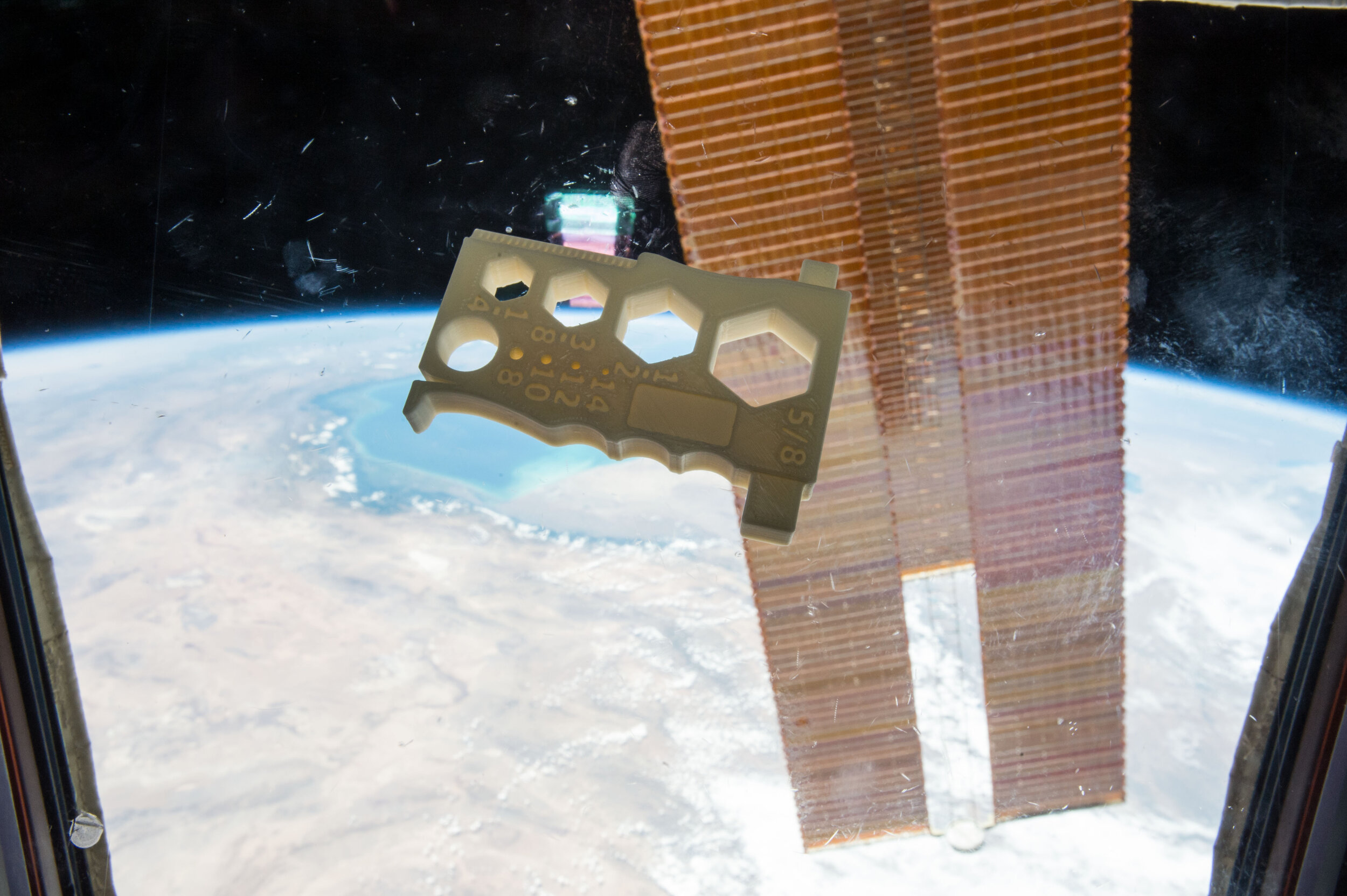
FIRST 3D PRINTED THE WINNING MODEL FROM THE WINNING STUDENT
[ UX & platform ]
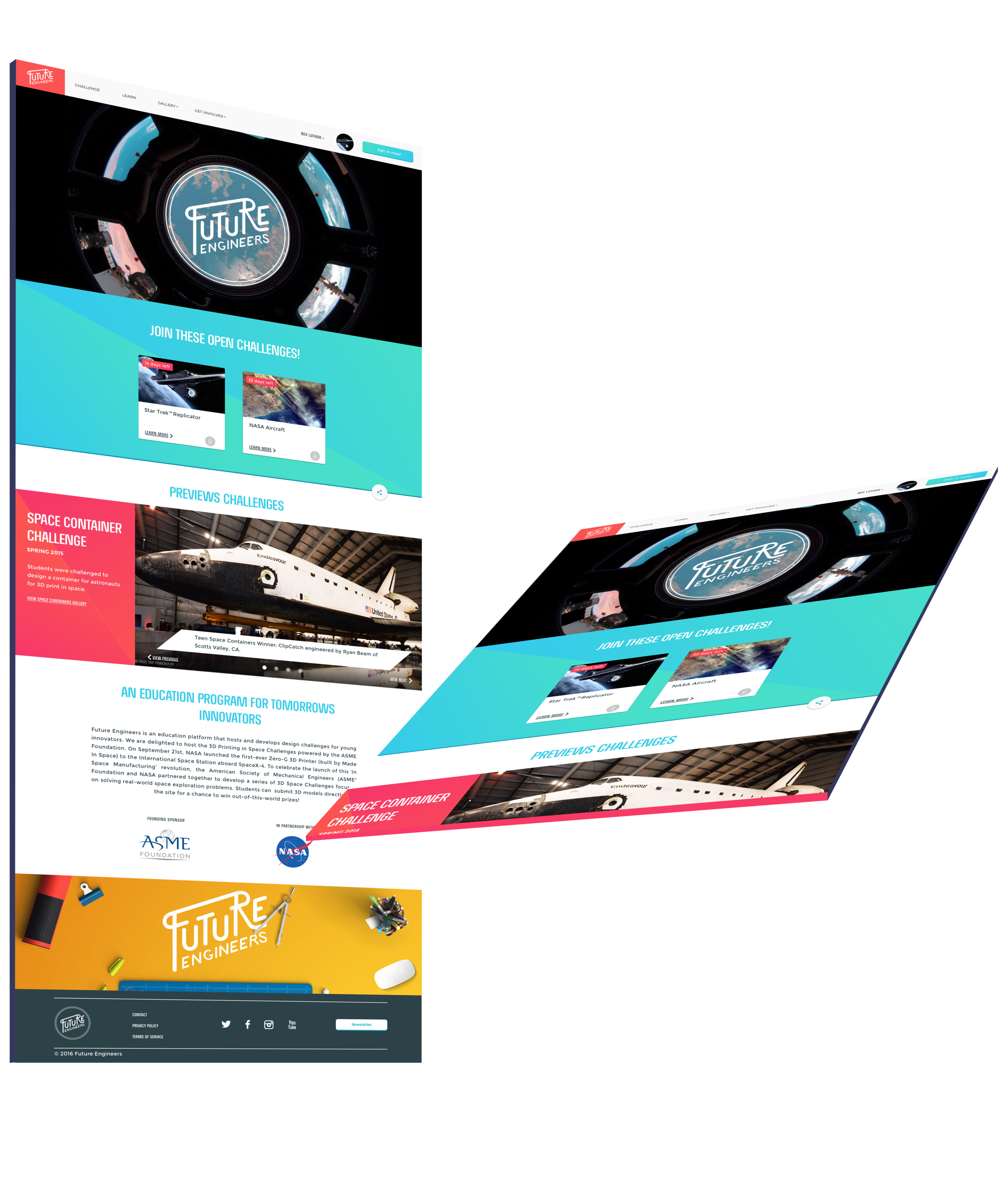
The site had two main purposes; firstly to announce each challenge, secondly, to provide inspiration for the students and educators. The site simply consists of a main navigation and gallery with all the uploaded designs from the students. On the home page you have all the challenges and information about important event and news.
“As a result the program itself got successful and gained a grant from the US Department of Education for 2 years. ”
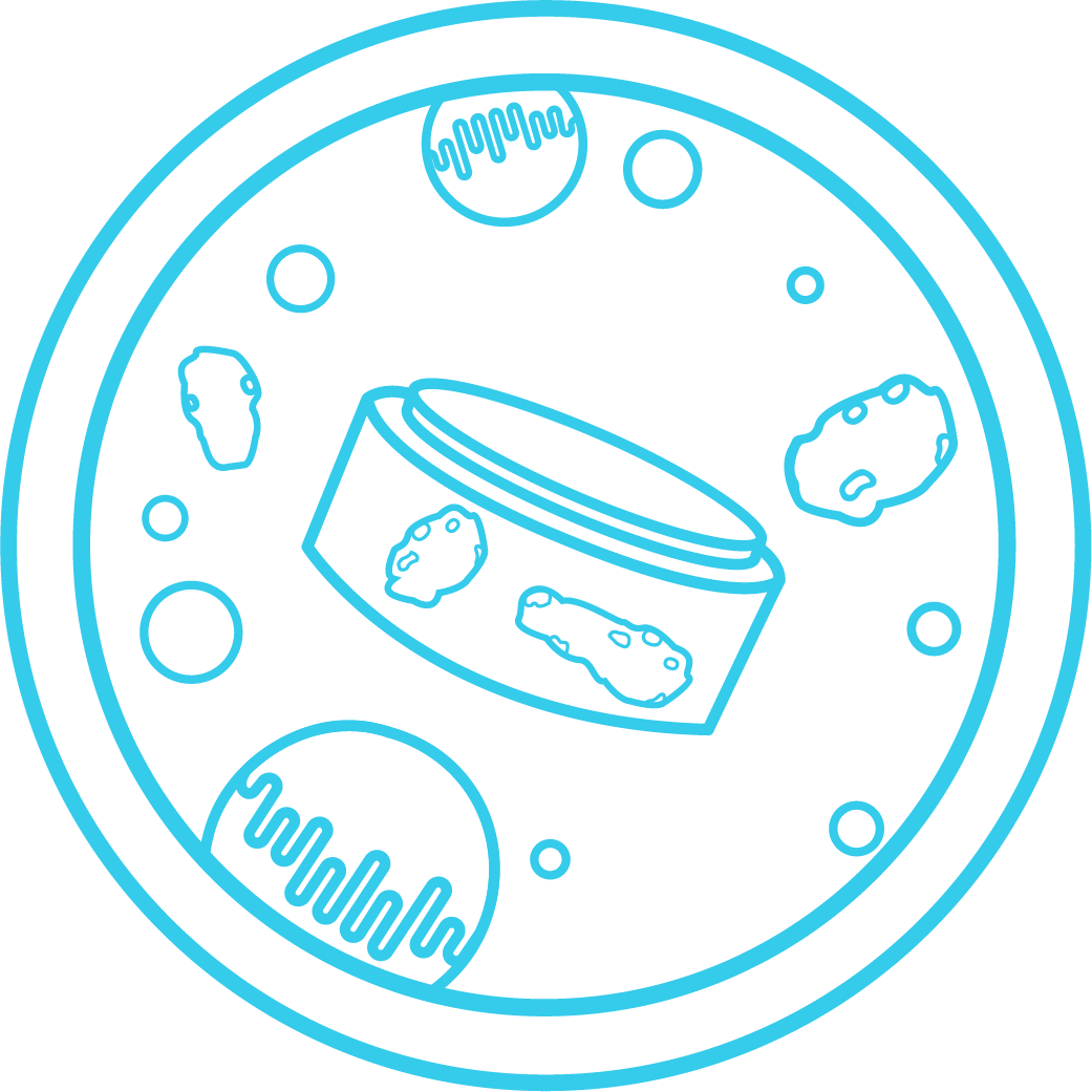
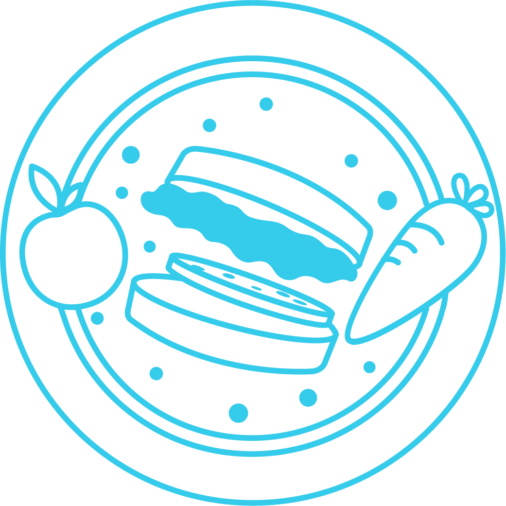
[ Logotype & Illustrations ]
Based on the logo I also created a series of illustrations for each challenge, representing a unique design challenge. The illustrations are to spark the imagination of the student. Everything from containers, to insects, food in space was illustrated.
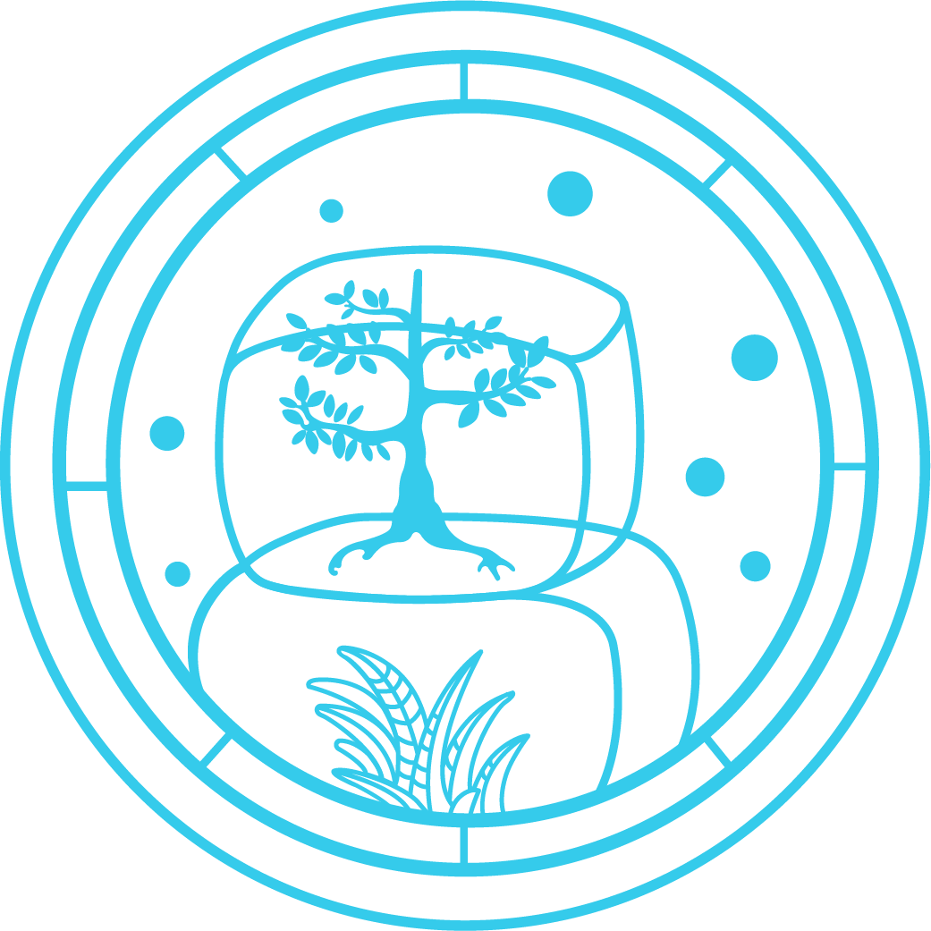
The logotype was a joy to create, the client was calling for a playful piece of statement to represent the brand. One inspiration came from the old Apollo symbols and its flowing shape. The direction of the text gives you a feeling forward momentum.
“The illustrations were to spark the imagination of the student. ”